

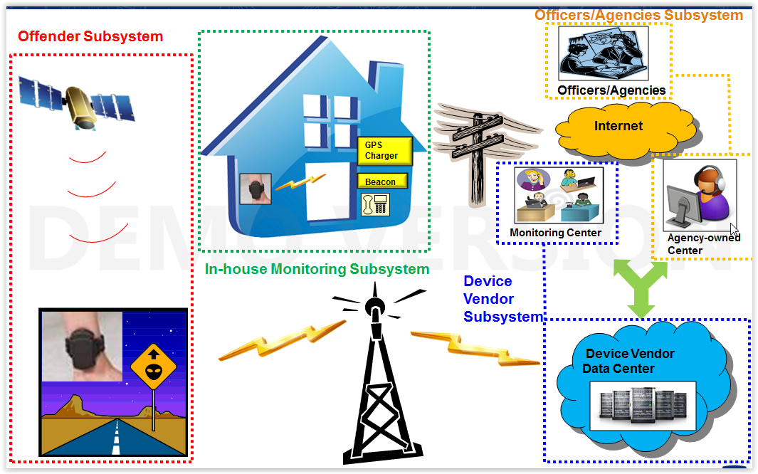
How Do You Measure Whether an Electronic Monitoring Program Is Working?
England and Wales — one of the few jurisdictions publishing comprehensive EM statistics — report that RF electronic monitoring reduced breach rates from 16% to 7% and increased probation requirement completion from 54% to 65%. Community orders with EM showed reconviction rates of 17% versus 22% without, a 5-percentage-point reduction. But these metrics only exist because the UK government mandated systematic data collection from the start. Most US county programs can’t answer basic questions about their own effectiveness because they never defined what success looks like or established baseline measurements before launch.
The Five Metrics That Matter
1. Jail Bed Diversion Rate
This is the single most important metric for programs justified on cost savings. It answers: “How many people are we keeping out of jail who would otherwise be detained?”
How to measure: Track each EM enrollment’s detention alternative status. Was this individual held in jail before EM placement? Would they have remained detained without EM? Count only true diversions — offenders who would have been released anyway don’t count.
Target: Your program’s diversion target should be set before launch. A 200-device program targeting 150 active diversions at any given time represents 150 jail beds saved. Multiply by your per-diem jail cost to calculate realized savings.
Red flag: If your diversion rate is below 50% of active enrollments, you may be net-widening — monitoring people who don’t need it.
2. Program Completion Rate
What percentage of enrolled individuals successfully complete their monitoring period without premature termination?
Benchmark: England and Wales data shows 65% completion rates with EM versus 54% without. San Francisco’s pretrial program experienced only 40% completion (60% premature termination), driven by strict technical violation enforcement on a high-risk, largely unhoused population. Your target should account for your population’s risk profile.
How to measure: Track every enrollment from start to end. Categorize terminations as: successful completion, new arrest, absconding, technical violation (specify type), voluntary withdrawal, or transferred to higher custody. The termination reason distribution tells you where to focus improvement efforts.
Breakdown matters: A 70% completion rate is excellent if most failures are new arrests. It’s concerning if most failures are charging non-compliance — that’s a logistics problem you can fix, not a supervision failure.
3. False Alert Rate Per Device Per Month
How many alerts is each device generating that turn out to be non-events requiring no enforcement action?
Benchmark: Cook County documented over 80% false alert rates. Germany averaged one false alarm every 3 days per offender (roughly 10 per month). Best-in-class programs with optical fiber anti-tamper and multi-mode positioning report false alert rates below 2 per device per month.
How to measure: Categorize every alert as true positive (requiring enforcement action) or false positive (cleared after investigation with no violation confirmed). Break down by alert type: tamper, zone, GPS loss, battery, communication. This breakdown identifies whether your false alert problem is technology-driven (tamper sensor) or environment-driven (GPS coverage).
Why it matters operationally: At 10 false alerts/device/month across 200 devices, your monitoring center triages 2,000 false events monthly. At 12 minutes average per triage, that’s 400 staff hours — nearly 2.5 full-time positions dedicated entirely to investigating events that aren’t real.
4. Recidivism During Monitoring
What percentage of monitored individuals are rearrested or charged with a new offense during their monitoring period?
Benchmark: Washington DC’s program reduced new arrests by 24%. Cook County data showed EM reduced new pretrial cases by 7.4 percentage points versus unconditional release. England’s data shows 17% reconviction for EM community orders versus 22% without — with the greatest reductions for theft, robbery, and drug offenses.
How to measure: Track arrests, charges, and convictions for monitored individuals from enrollment date through monitoring end. Compare against a baseline: your jurisdiction’s recidivism rate for the same population without EM. If you don’t have a historical baseline, use the first 12 months of your program as the baseline and track improvement from there.
Nuance: Some EM programs will show higher detected recidivism because GPS data reveals behavior that would have gone undetected without monitoring. This is actually a sign the technology is working — the question is whether overall criminal behavior is reduced, not just whether you’re catching more of it.
5. Cost Per Supervised Day
What is the all-in cost to supervise one offender for one day on your EM program, including every expense category?
Include in the calculation:
- Device costs (purchase/lease, amortized over lifespan)
- Monitoring center staffing (salary + benefits, allocated per caseload)
- Field officer time (proportional to EM caseload)
- Software and data costs
- Charger replacement and device damage/loss
- Administrative overhead (enrollment processing, court reporting)
- Training costs (initial and ongoing, amortized annually)
Benchmark: Washington DC documented approximately $2.05/day ($750/year). Commercial GPS monitoring services typically range from $5–$15/day. Your all-in number should be compared against your per-diem jail cost to demonstrate the savings ratio.
Secondary Metrics Worth Tracking
| Metric | What It Tells You | Collection Method |
|---|---|---|
| Failure to appear (FTA) rate | Are monitored defendants showing up for court? | Court records matched to EM enrollment |
| Average response time to alerts | How fast is your monitoring center reacting? | Alert management system timestamps |
| Device uptime percentage | What % of time is each device actively reporting? | Monitoring platform analytics |
| Charging compliance rate | What % of offenders maintain adequate battery? | Low-battery alert frequency per offender |
| Officer caseload ratio | How many EM cases per officer? Is it sustainable? | HR and caseload assignment data |
| Victim contact incidents (DV) | Zero is the target for DV exclusion zone programs | Victim advocate reports, police reports |
| Employment retention | Are monitored individuals maintaining jobs? | Check-in interviews, employer verification |
Building a Reporting Cadence
- Daily: Alert volume and triage summary (monitoring center supervisors)
- Weekly: Device status report — active, offline, low battery, pending swap (operations manager)
- Monthly: Program dashboard: enrollment count, completion rate, false alert rate, diversion count, cost per day (program director)
- Quarterly: Outcome report: recidivism, FTA, victim safety incidents, comparison to baseline (presented to agency leadership and funding bodies)
- Annual: Comprehensive program evaluation with cost-benefit analysis (presented to county commissioners, legislature, or grant funders)
The Baseline Problem
You cannot prove your program works without data from before it started. Before launching, capture:
- Average daily pretrial jail population for the 12 months prior
- Per-diem jail cost
- FTA rate for your target population (pretrial defendants) without EM
- Recidivism rate during pretrial release without EM
- Average pretrial detention length for your target population
This baseline is your program’s “before” picture. Every metric you report going forward will be compared against it.